Payment flow
Payment Flow Decisions: Balancing Usability, Accessibility, and Security
UX/UI
context
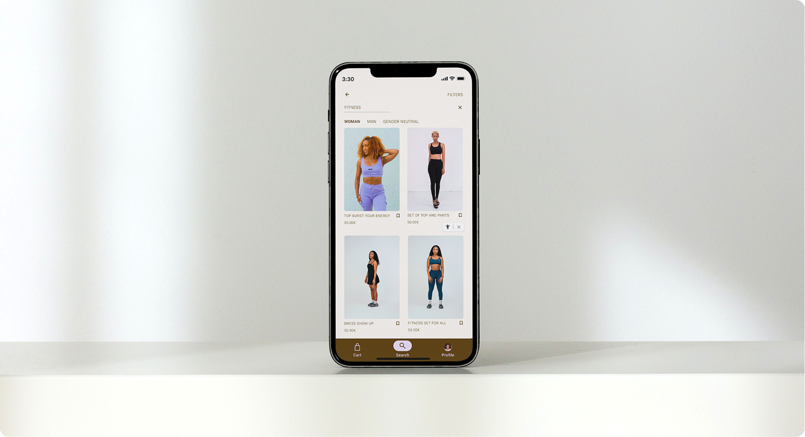
Conceptual design of a mobile e-commerce checkout flow focused on improving clarity during payment selection.problem
Users often feel uncertain when choosing a payment method.
Differences between credit card, MB Way and PayPal are not immediately clear, leading to hesitation and potential drop-off.Reduces cognitive overloadClarifies payment optionsReinforces trust through visual hierarchycApplies a consistent UI system
objective
design approach/decisions
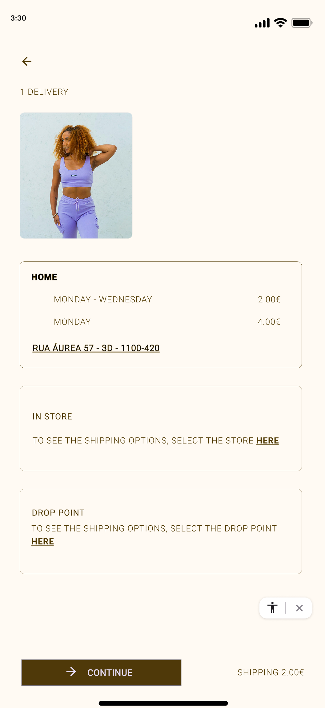
Step-by-step progression
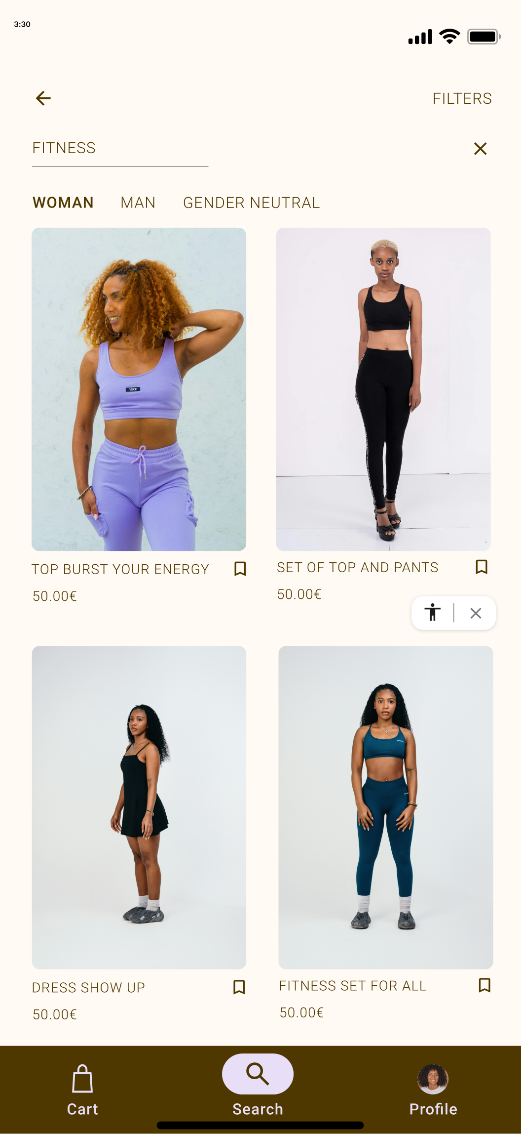
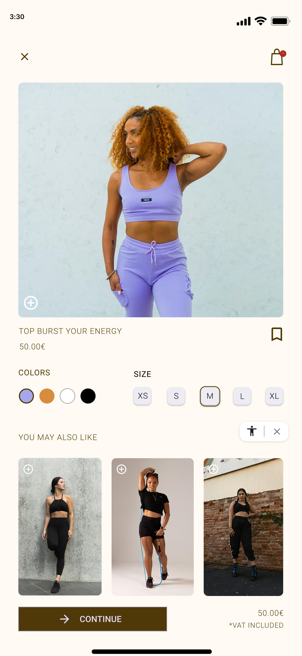
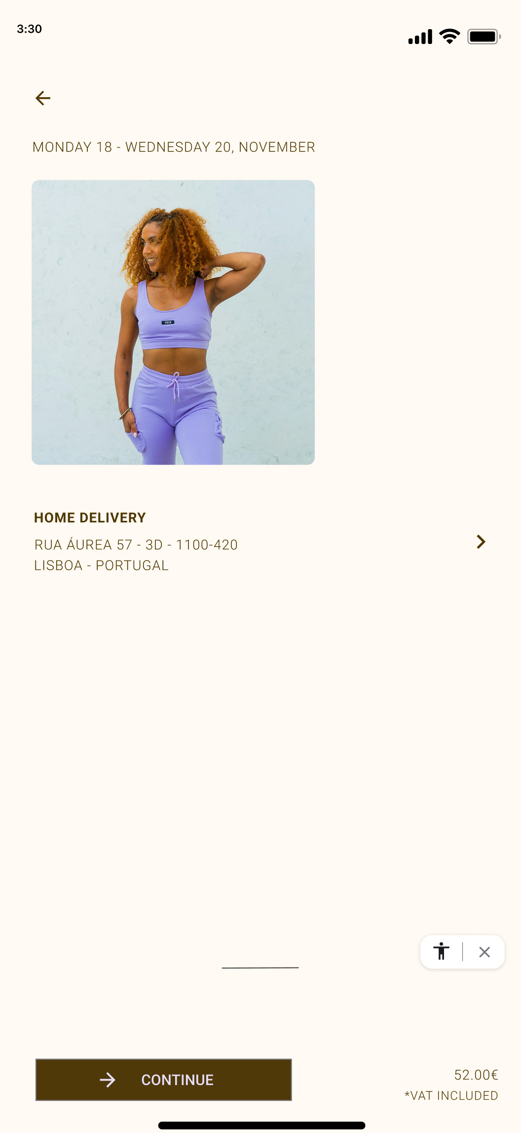
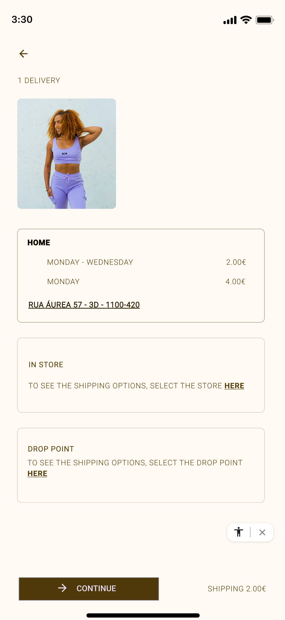
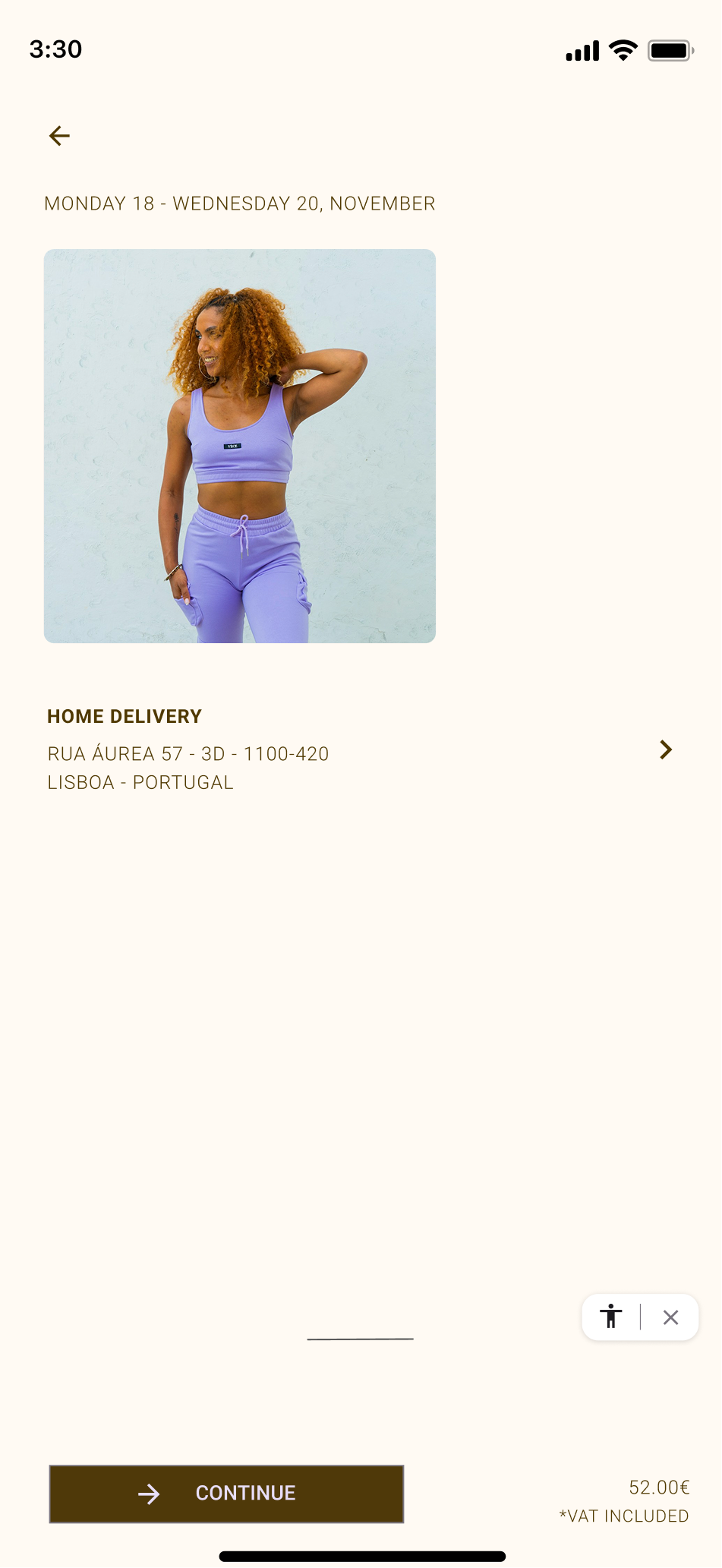
The flow is divided into clear stages: product, shipping, payment and confirmation, reducing mental load.
01
Visual hierarchy
Primary actions are emphasized through contrast and consistent button placement.
02

Structured payment selection
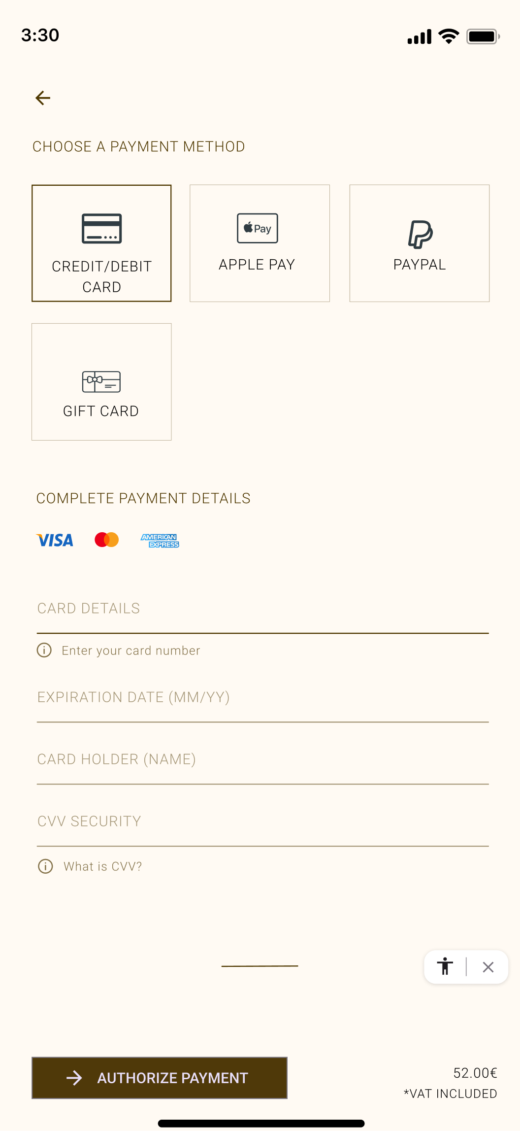
Payment methods are displayed in clearly defined cards, avoiding ambiguity and improving scannability.
03
04
Progressive disclosure
Card details only appear once the credit card option is selected, minimizing initial clutter.
05
UI system
Consistent spacing system
Reusable components
Defined typography scale
Clear CTA hierarchy


Visual Flow
The flow prioritizes continuity and predictability, ensuring users always understand where they are in the process.
06