Linha Ética
UX/UI
Landing Page for Corporate Reporting Channel | Studio Venturas
context
challenge
team
The “Linha Ética” is an initiative by Disque Denúncia that provides an independent and secure channel for reporting irregularities, promoting ethics and transparency within organizations. The project aims to facilitate access to information and encourage trust in the ethical communication process.
The challenge was to create an institutional platform that is clear and trustworthy, one that conveys seriousness, support, and transparency,while remaining accessible and easy to navigate for different user profiles.
The project was developed collaboratively at Studio Venturas with a multidisciplinary team:
Visual Identity Camila Sugai
Custom Icons Camila Sugai
WordPress Development Giovanna Ornellas
UI and Page Structure Érika Soares

process
01
Content and goal analysis of the website
04
Iterative Refinements
02
Definition of the page structure (layout and visual hierarchy)
05
Final Pages
03
Interface creation in Figma based on the visual identity
06
Reflection and learnings
01
WHATS IS IMPORTANT?
ANONIMITY
The user can report without providing any identifying information.
EMOTIONAL SAFETY
Language avoids legal threats or intimidating tone.
The first step was understanding the emotional and ethical context of a reporting channel. The main goal was to create a space where users feel safe, informed, and in control when reporting sensitive issues.
CLARITY
Every step explains what happens before
any action is required.
USER CONTROL
The user decides when and how to proceed.
02
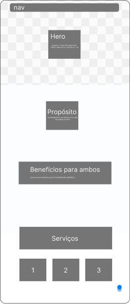
The first section focuses on building trust and context. It introduces the purpose of the Ethics Line, reinforces confidentiality, and helps users feel emotionally safe before engaging with sensitive content.The structure was designed to reduce anxiety by presenting clear information before any action, allowing users to understand the process before submitting a report.
scroll continues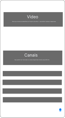
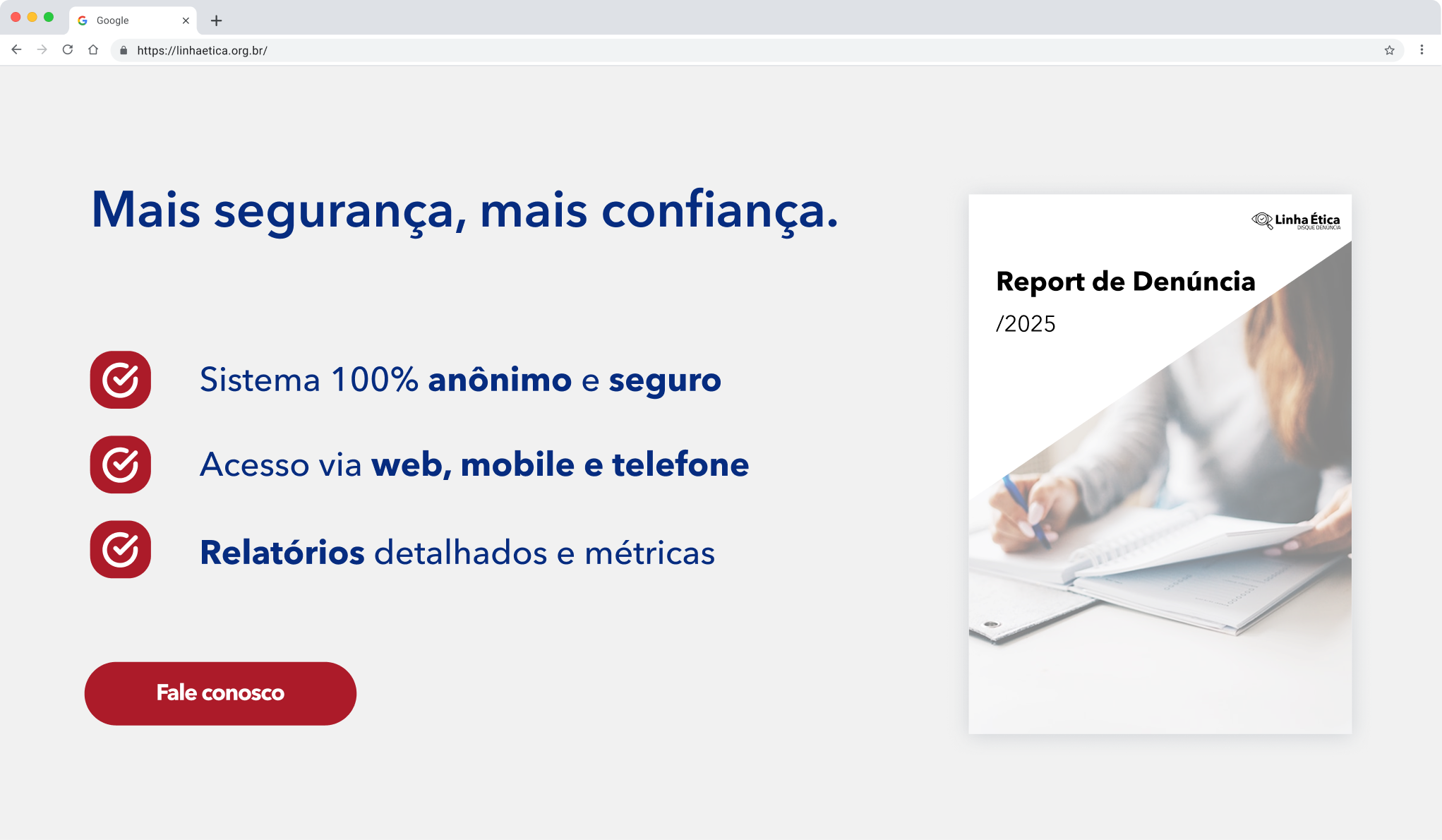
In the second section, the experience shifts from reassurance to guidance. Reporting channels are introduced alongside an explanatory video, helping users understand when and how to use the Ethics Line.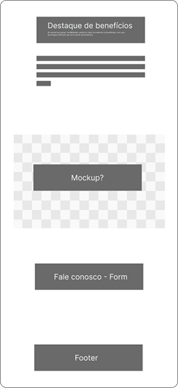
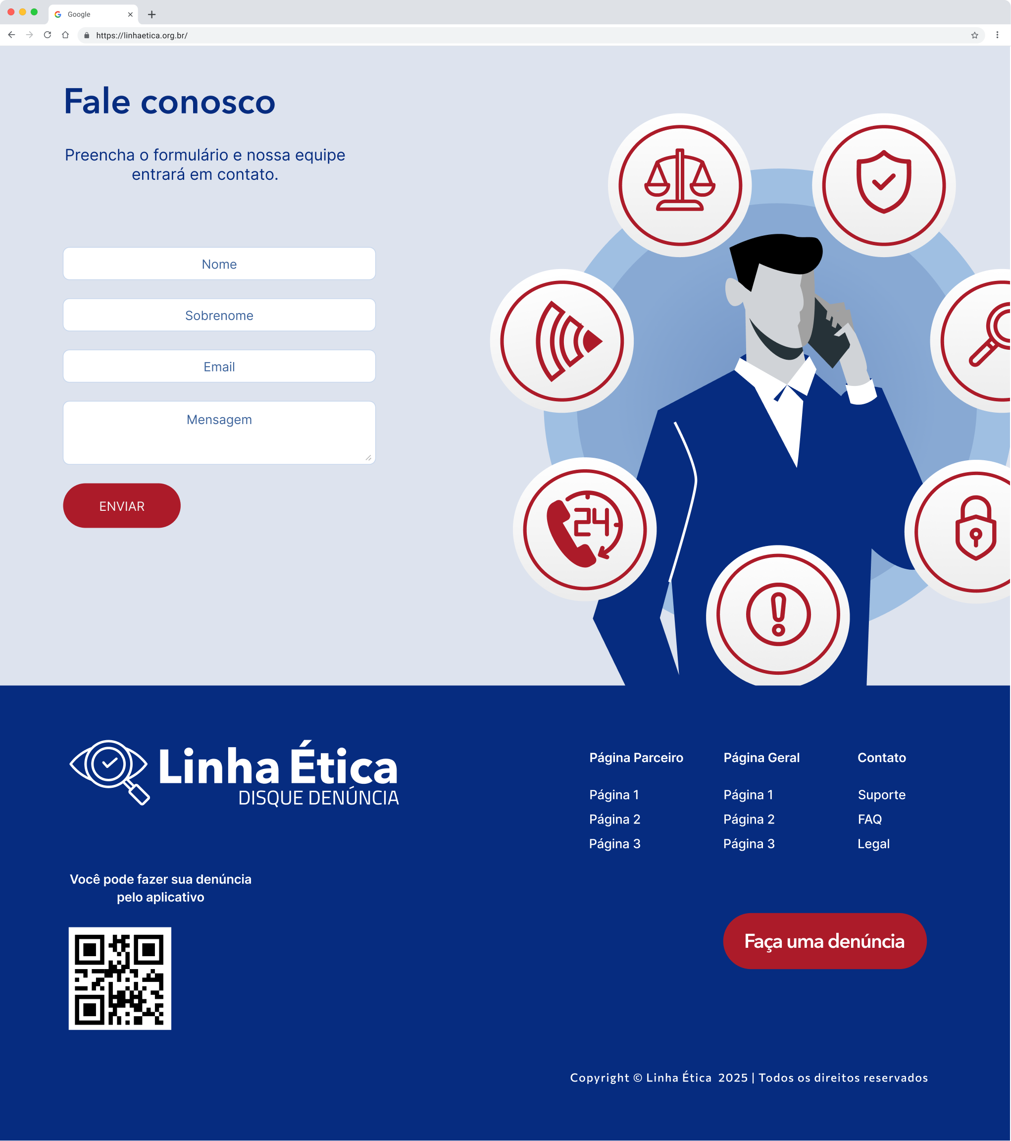
The final section reinforces the benefits of the service and transitions the user into action. By this point, users have received all necessary information and reassurance, making the call to action feel natural and low-pressure.03
real people imagery



#062C80
The interface was designed in Figma following the established visual identity, with a strong focus on clarity, trust, and emotional safety, essential aspects for an Ethics Line and whistleblowing context.

colors
#EBEBEB
#D0D3D7
primary/default
secondary/pressed
institutional credibility

#AC1B29

#000000
The interaction system was intentionally minimal. Only primary and secondary button variations were created to maintain clarity and reduce decision fatigue in a sensitive context.


#062C80
components

#062C80
safe environment

04
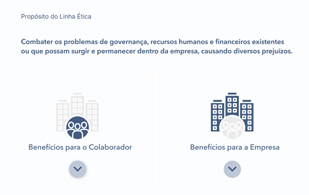
Key interface improvements
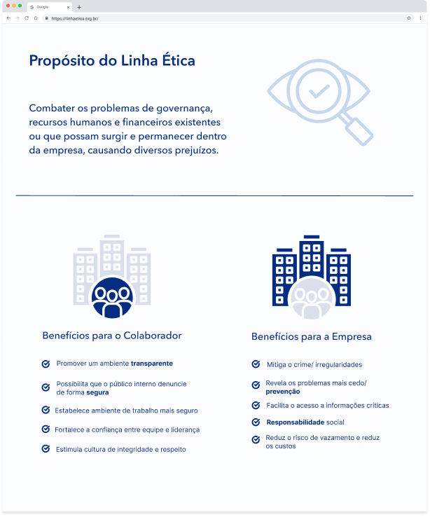
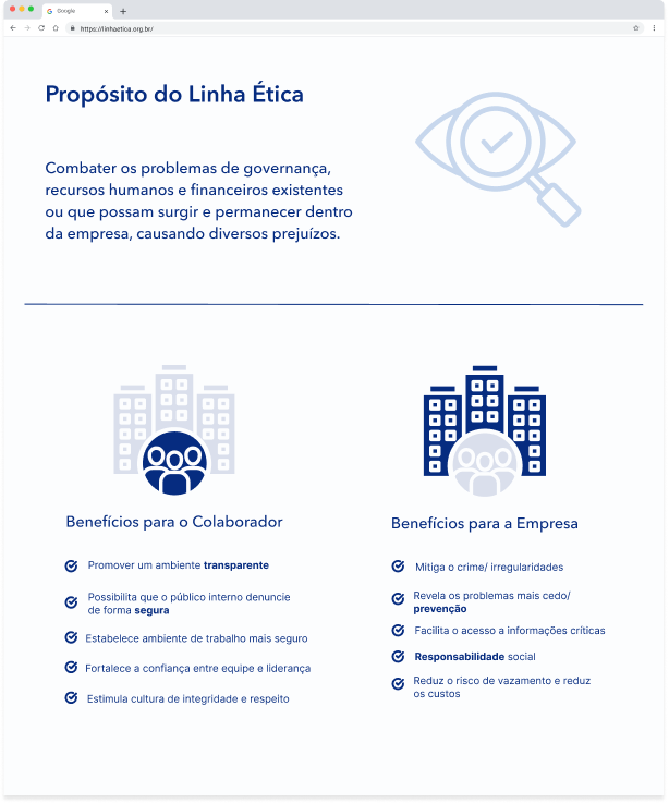
The “Purpose” section evolved from a compact informational block into a more structured and hierarchy-driven layout. Visual separation and clearer alignment were introduced to improve readability and scannability.
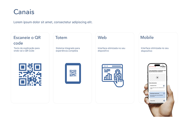
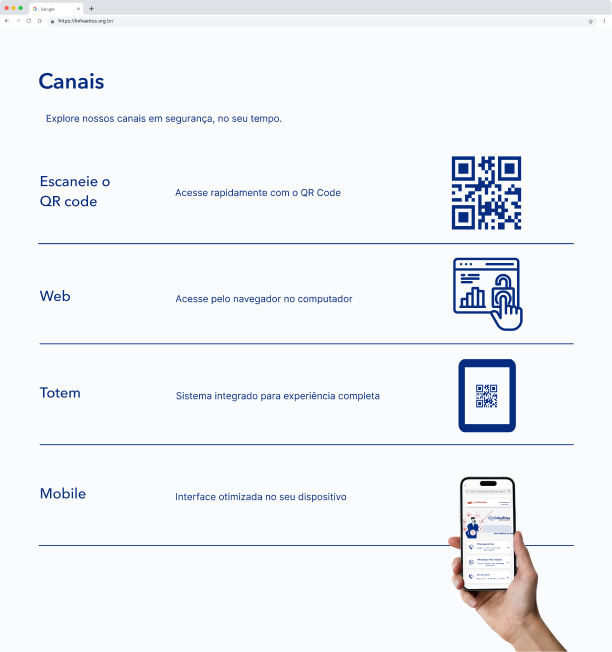
The channels section shifted from a card-based layout to a more structured, informational format. This change prioritizes clarity over visual segmentation, making each reporting option easier to understand at a glance.
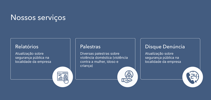
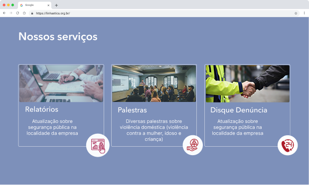
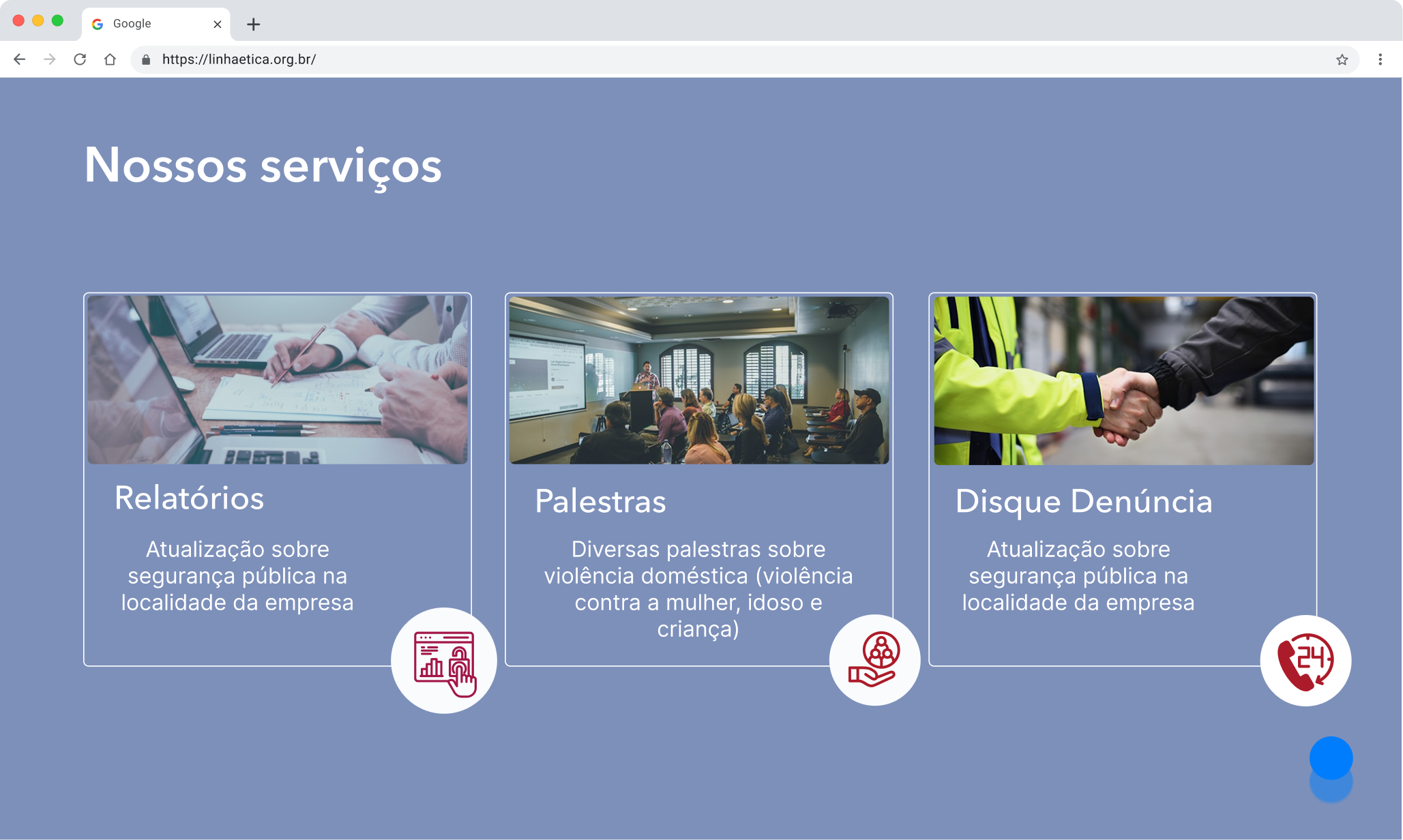
The services section evolved to incorporate real imagery and clearer contextual descriptions. This shift increases perceived credibility and helps users better understand the tangible impact of each service offering.
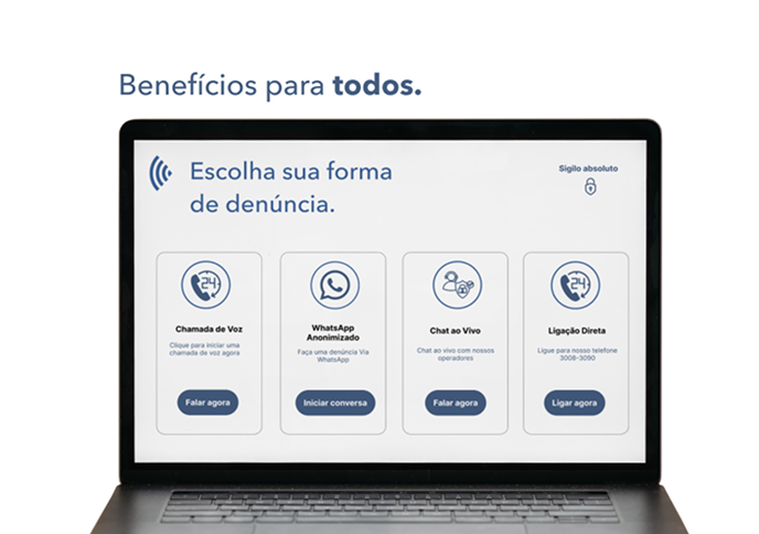
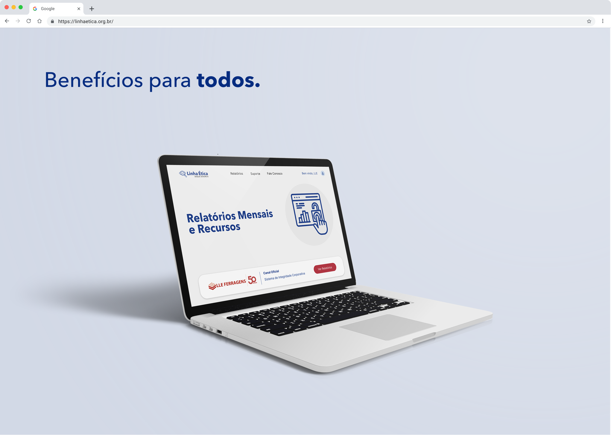
The benefits section was refined to present the platform in a more realistic and aspirational context. By showcasing the product within a tangible environment, the interface feels more credible and concrete rather than conceptual.

Final pages
05


What I learned
-
Designing for sensitive contexts requires emotional pacing
-
Fewer components can improve clarity
-
Institutional tone must balance trust and approachability