Rabisco Market
Visual identity for an independent fair featuring print art and ceramics.
context
Project type: visual identity / social media / event Target audience: independent artists, creatives, young adults Channels: Instagram, posters, physical materials
A visual system created to promote a creative, hands-on, youthful, and accessible fair.
visual direction
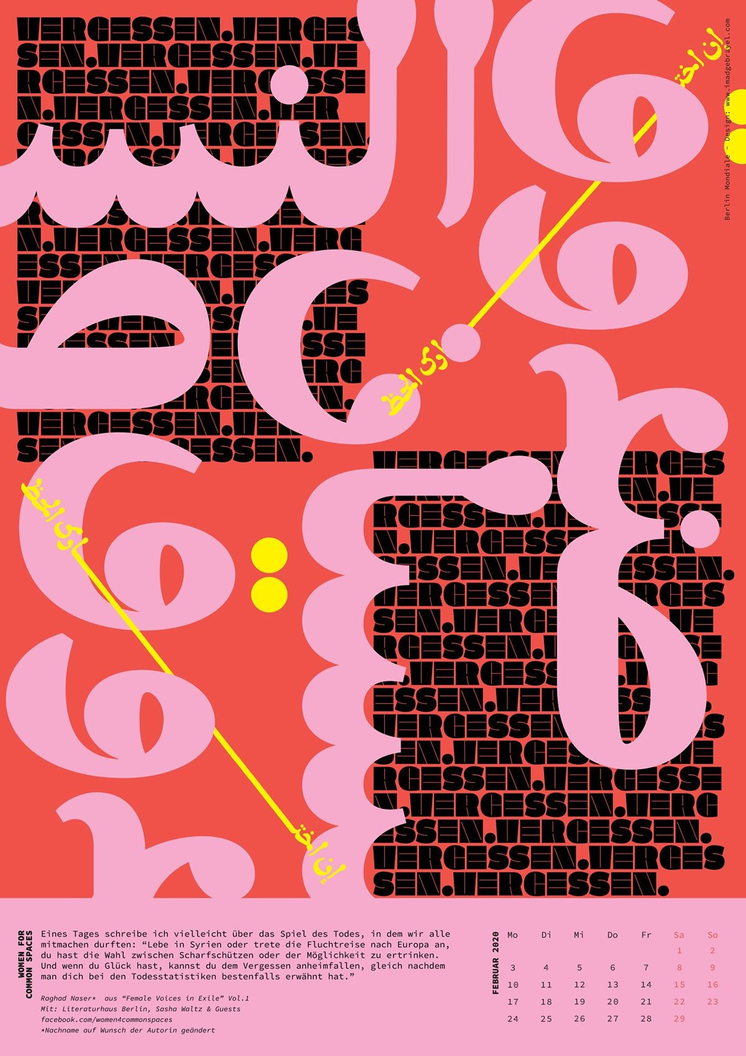
BOLD CONTRAST
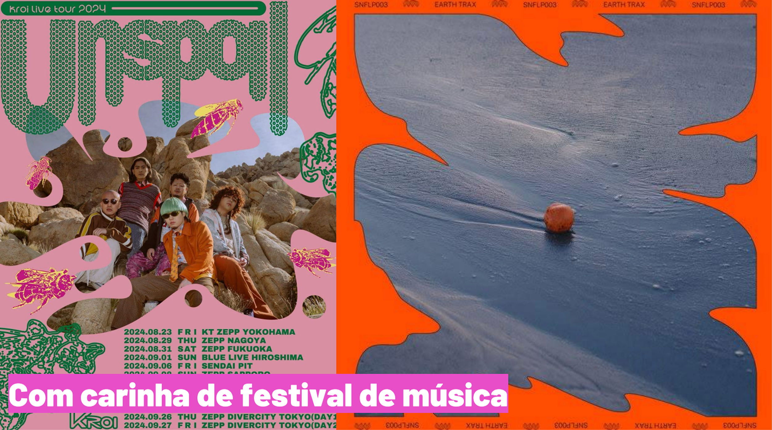
EXPRESSIVE TYPOGRAPHY
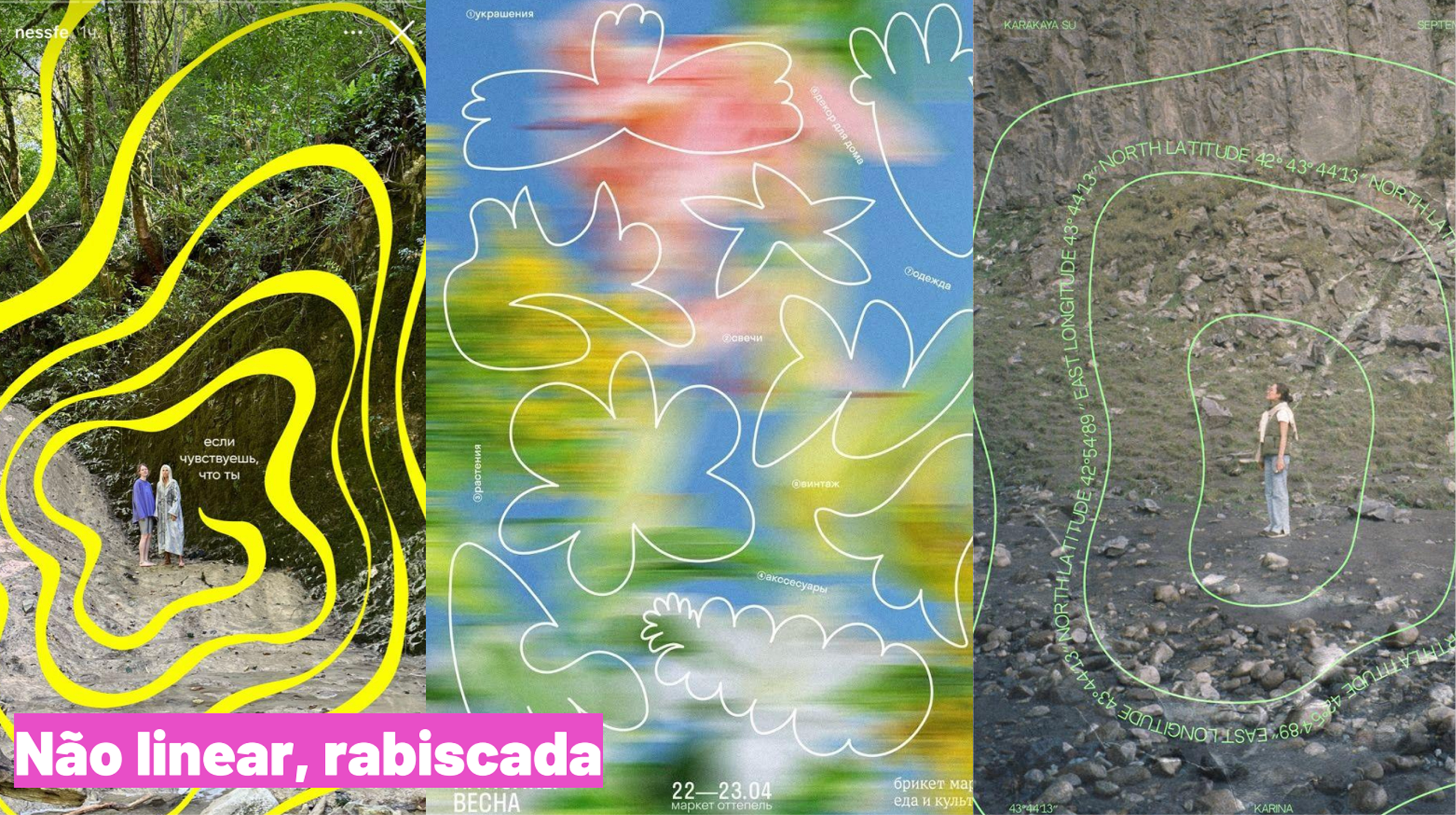
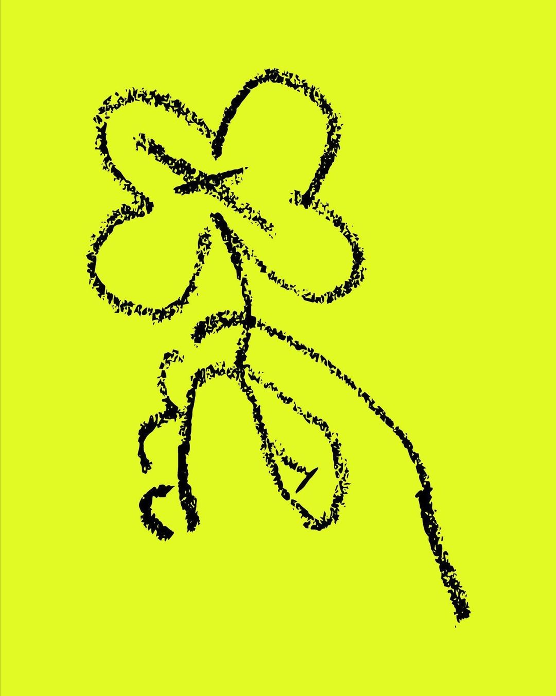
HANDMADE MARKS
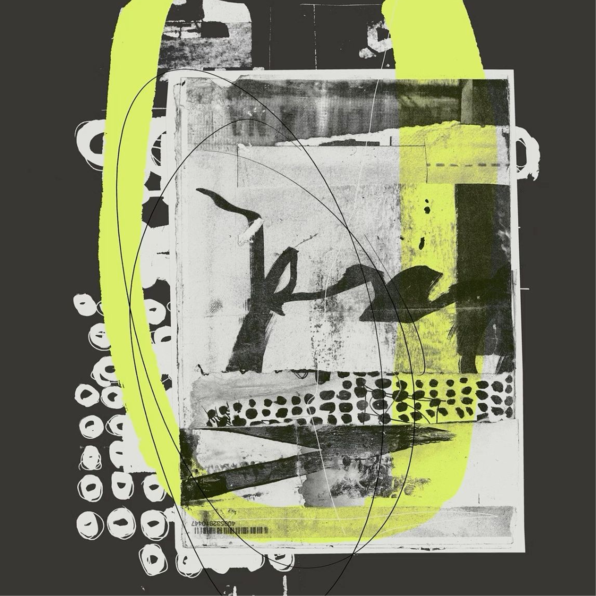
Inspired by experimental poster design,
independent publishing and handmade processes.
logo
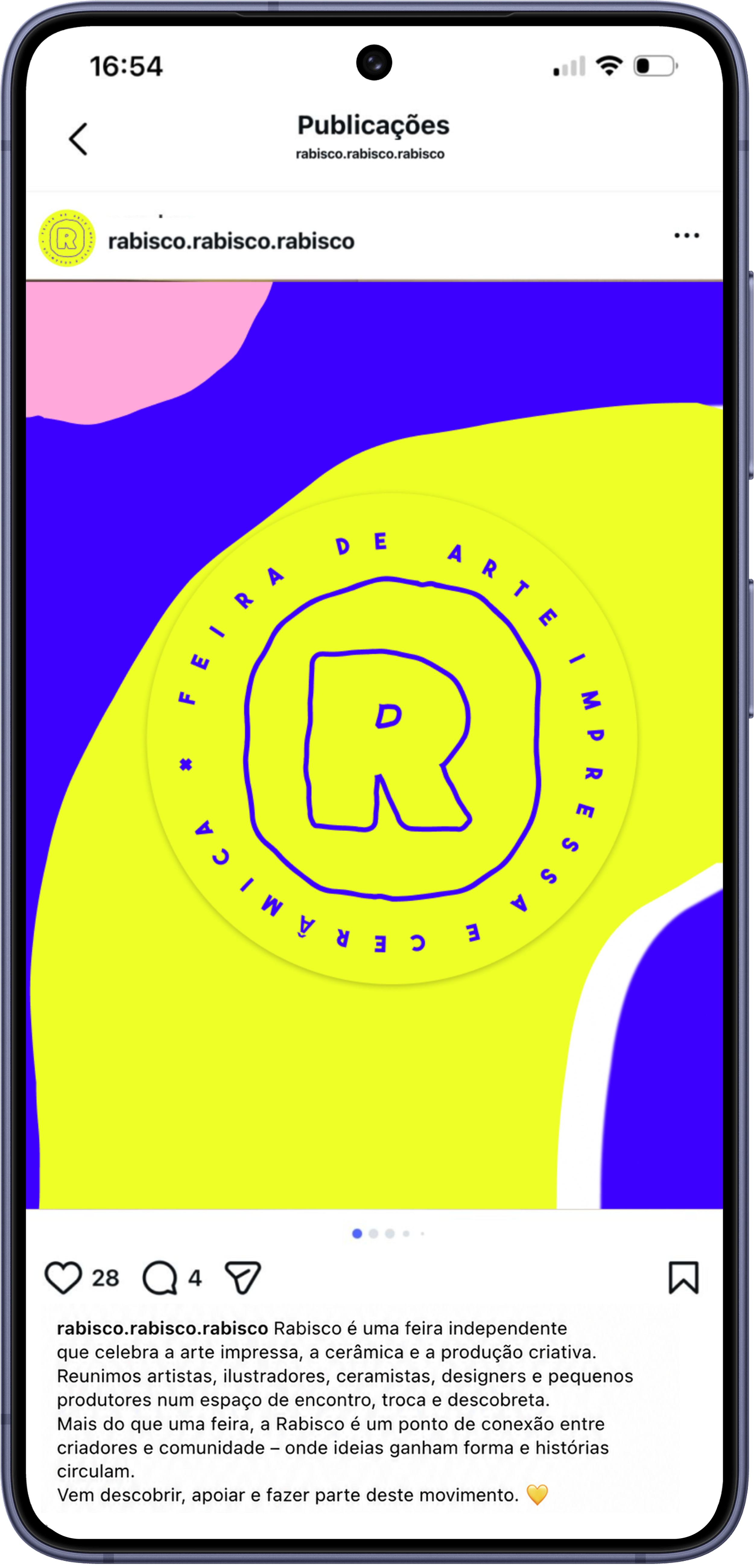
A stamp inspired by independent publishing.
The logo was designed as a graphic stamp, referencing printed matter, handmade production and the collectible nature of independent fairs.
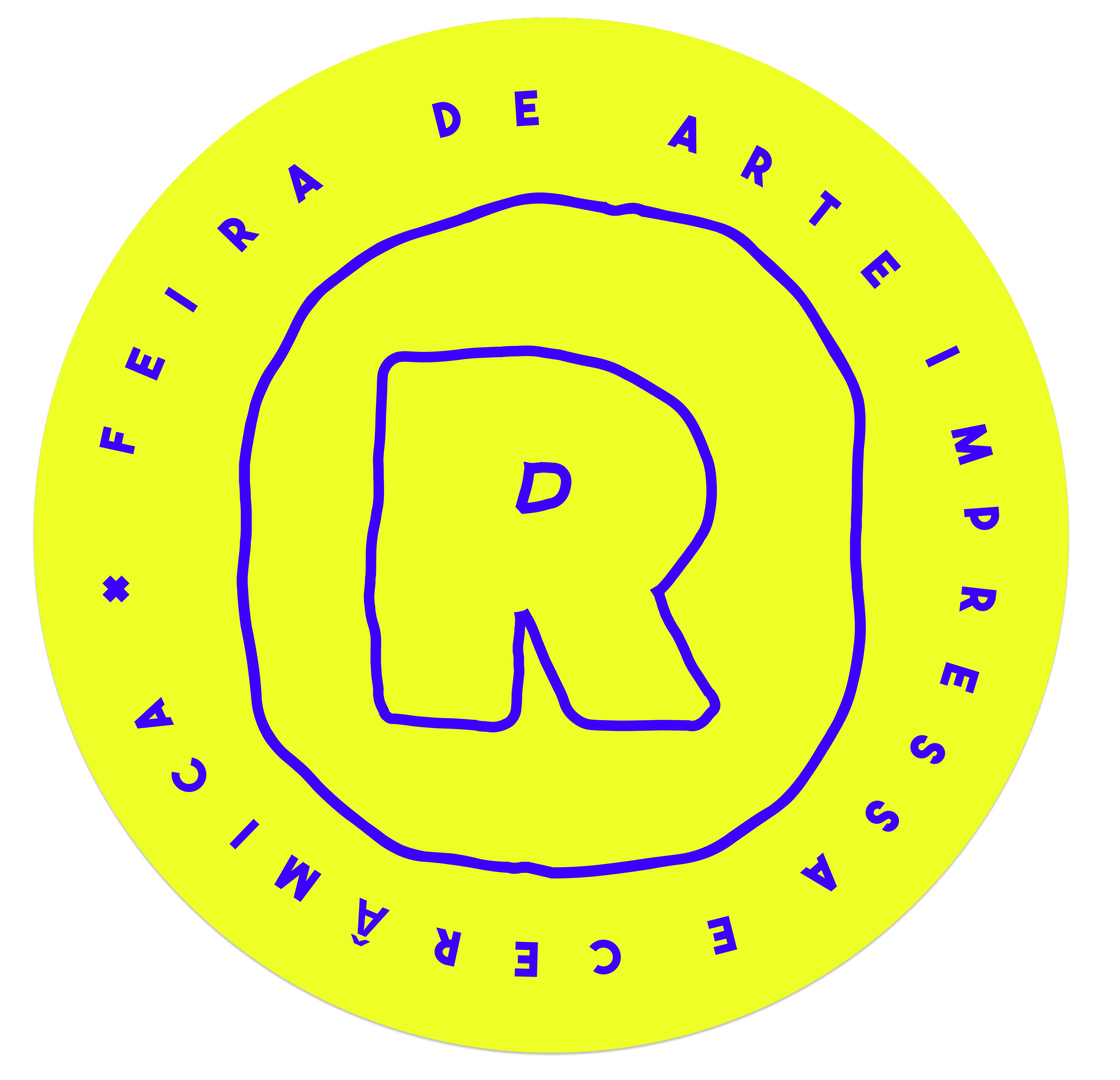
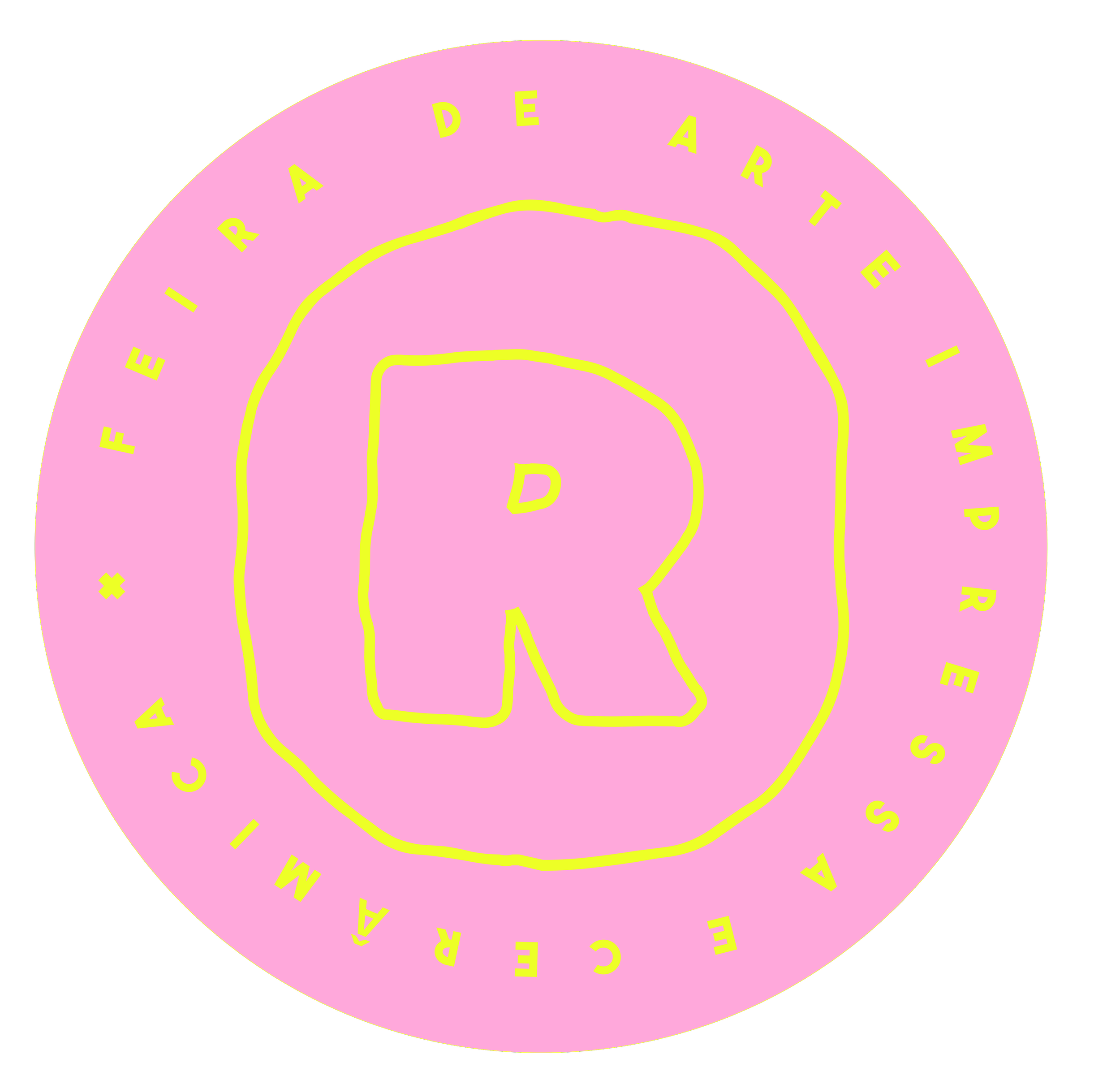
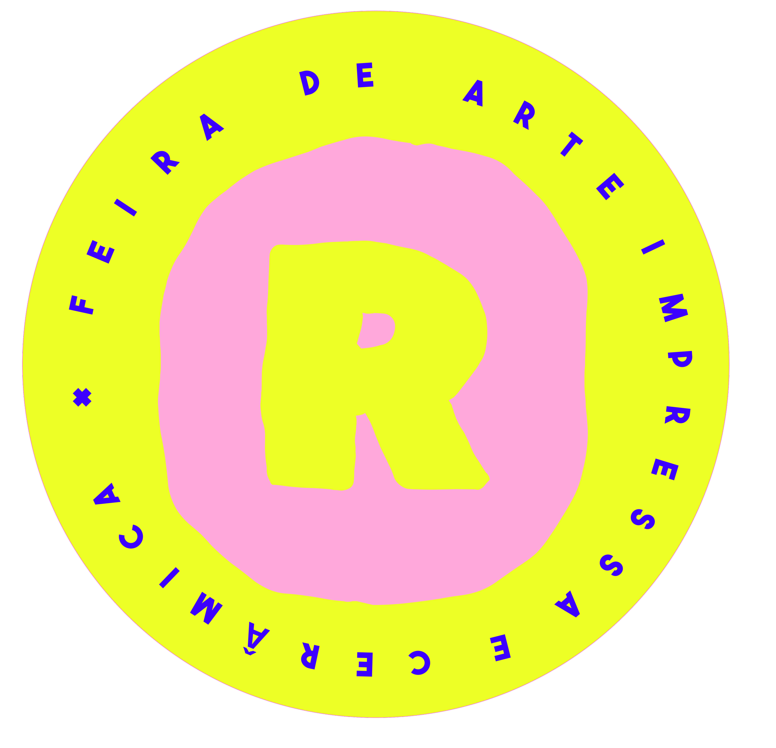
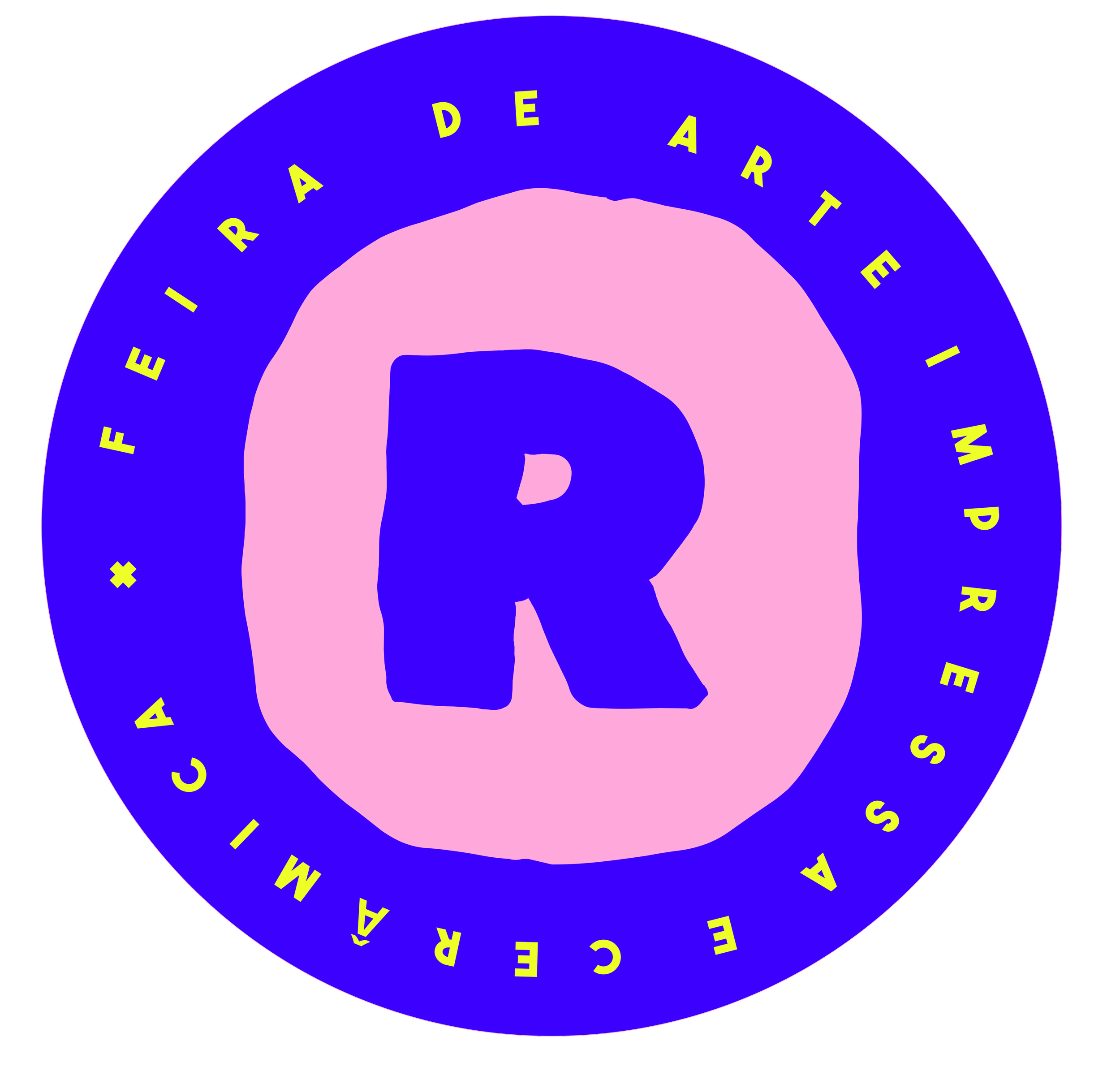
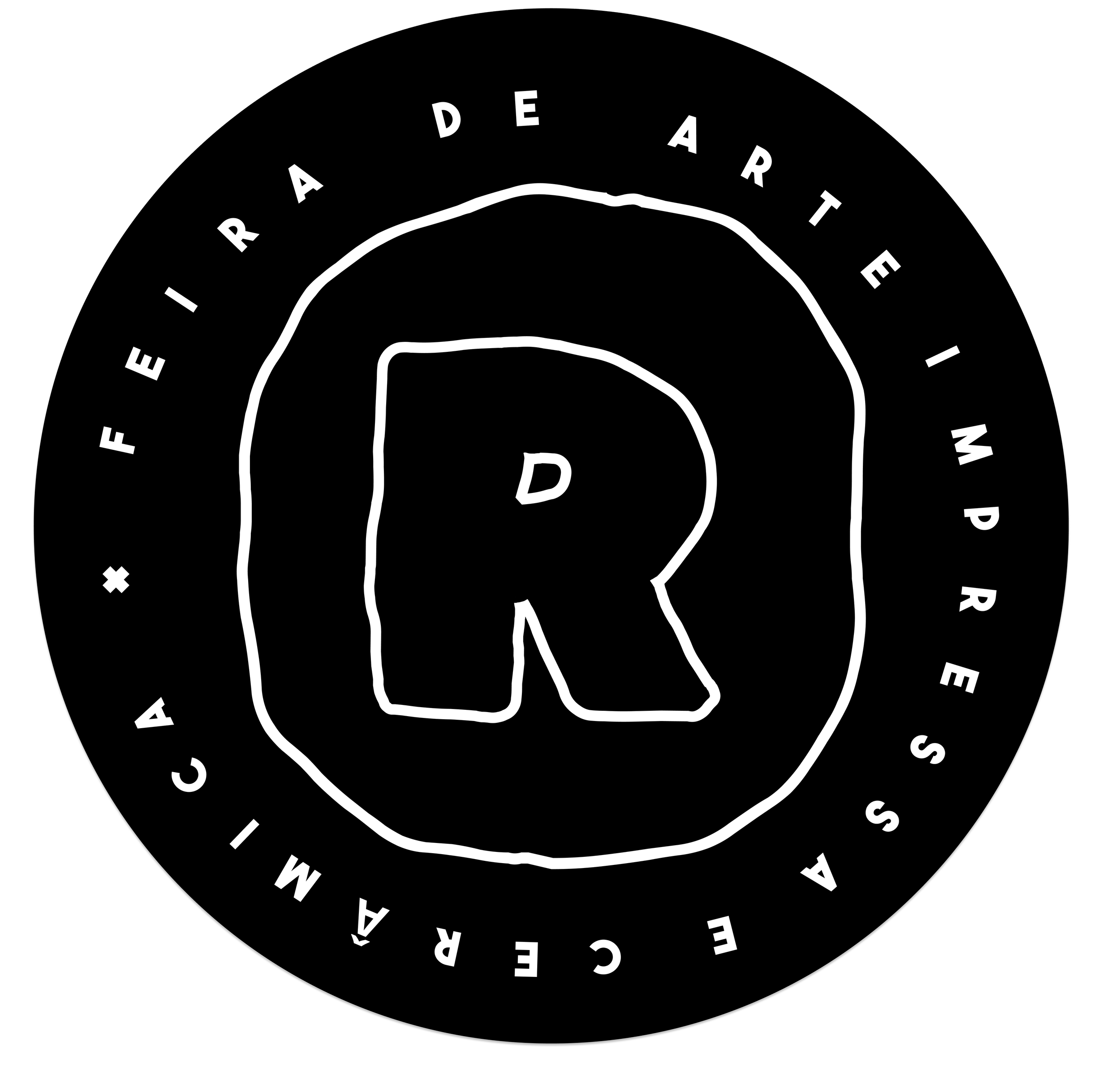
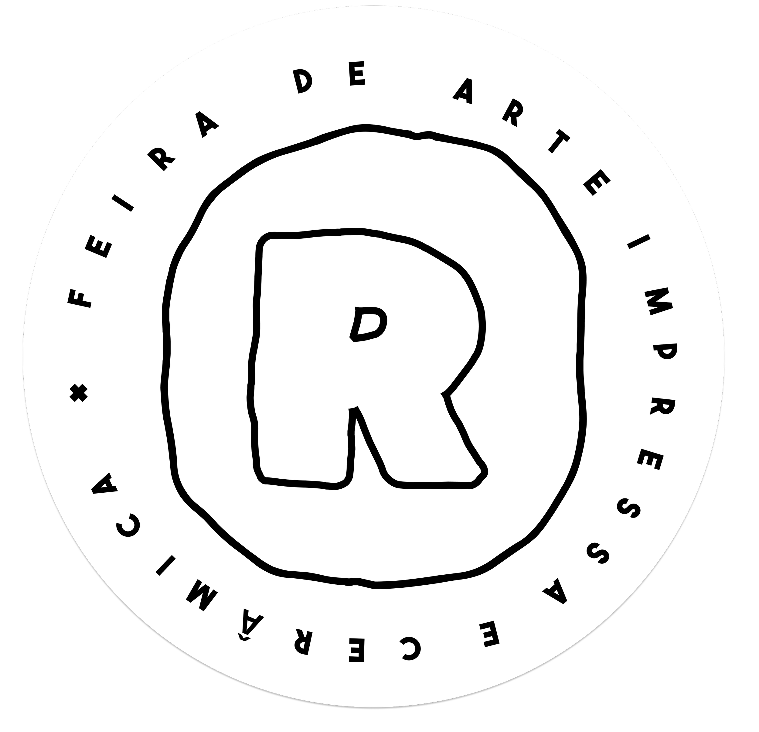
Designed for flexibility.
The identity relies on interchangeable color combinations, allowing the system to remain playful while maintaining recognition.
A set of graphic elements was developed to create a flexible and expressive identity system.
visual toolkit
colors


typography
typography as a graphic element.




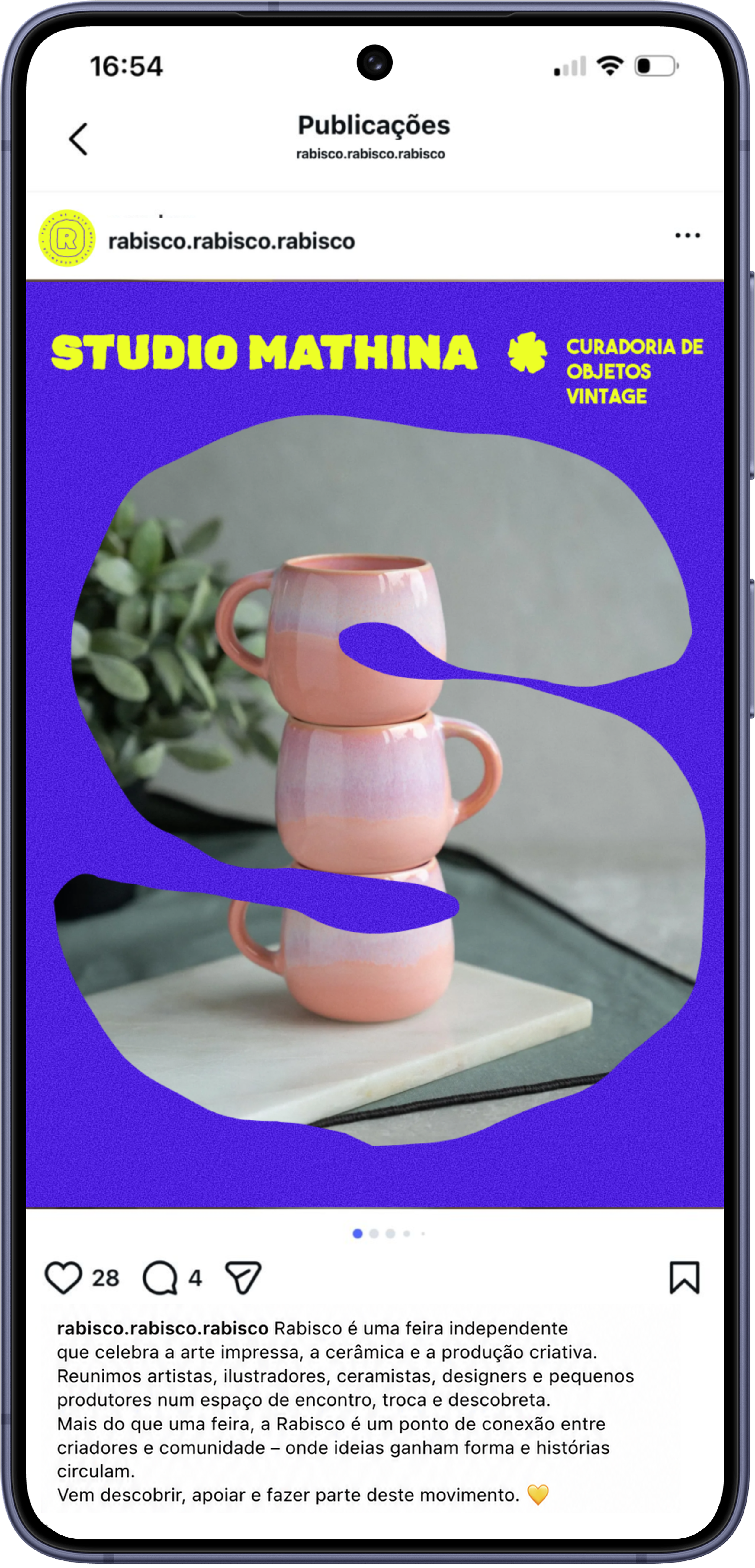
Some of the masks feature a subtle noise texture to evoke the handcrafted quality often found in printed materials.


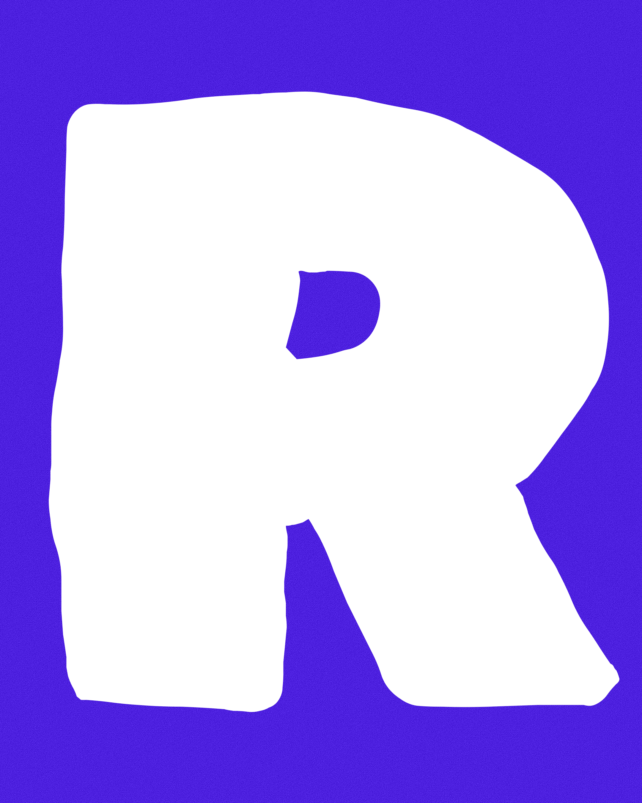
A bold and playful display typeface used to create impact, energy and visual recognition across key communication pieces.
Used to create expressive headlines inspired by handmade signs and independent publishing.
Used for supporting information and event communication.
Typography was treated as both a communication and graphic tool, becoming a key element in the construction of the visual language.
social media application
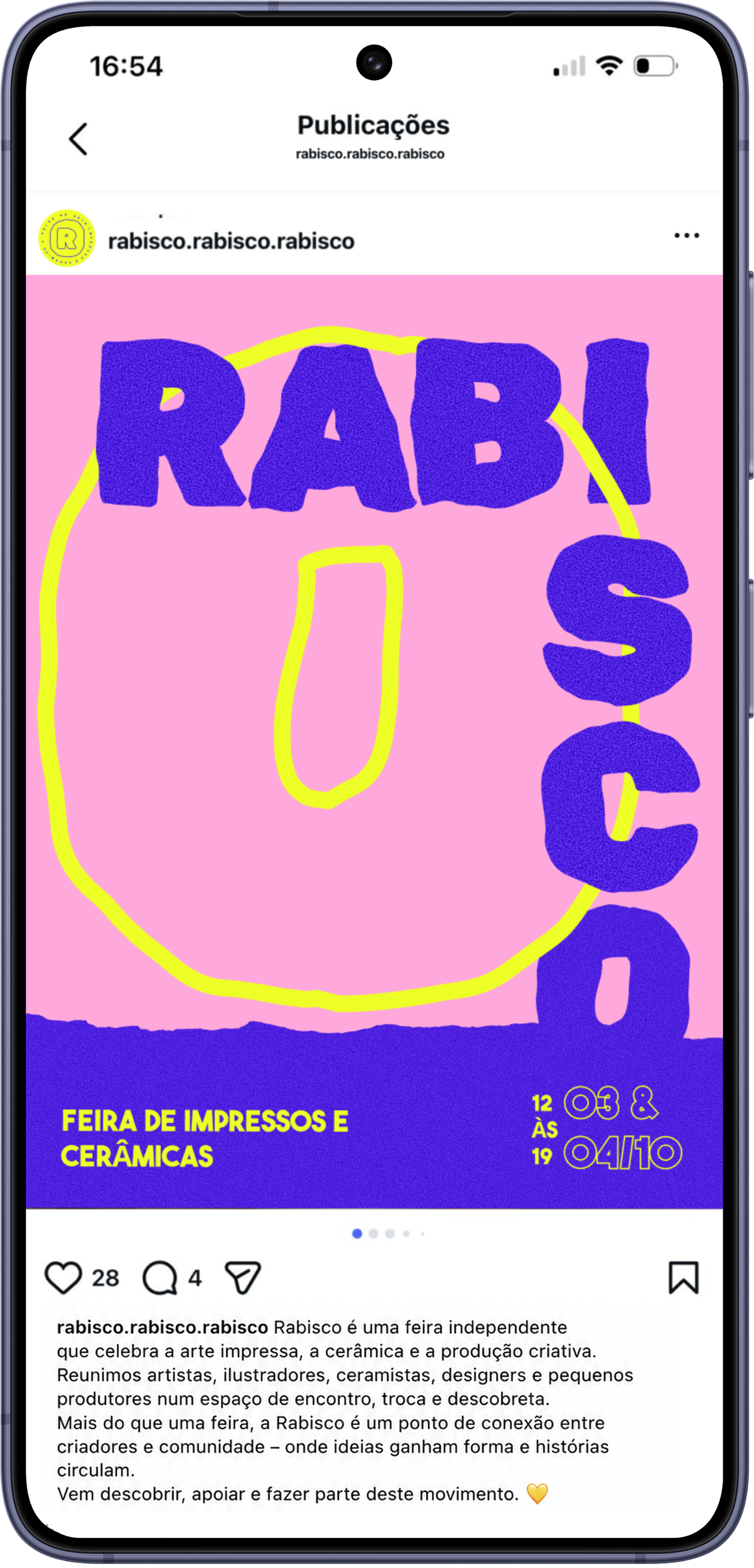
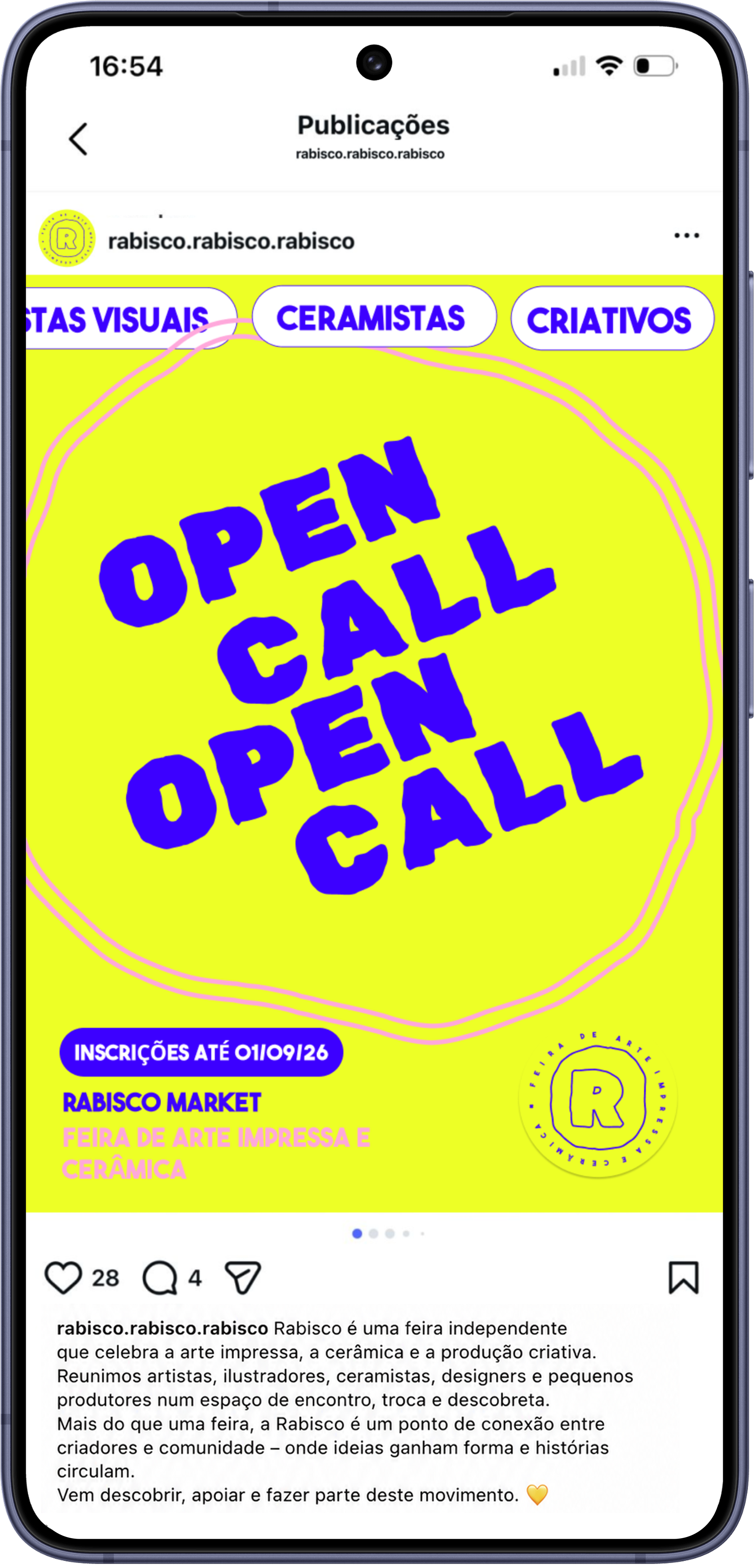
posters
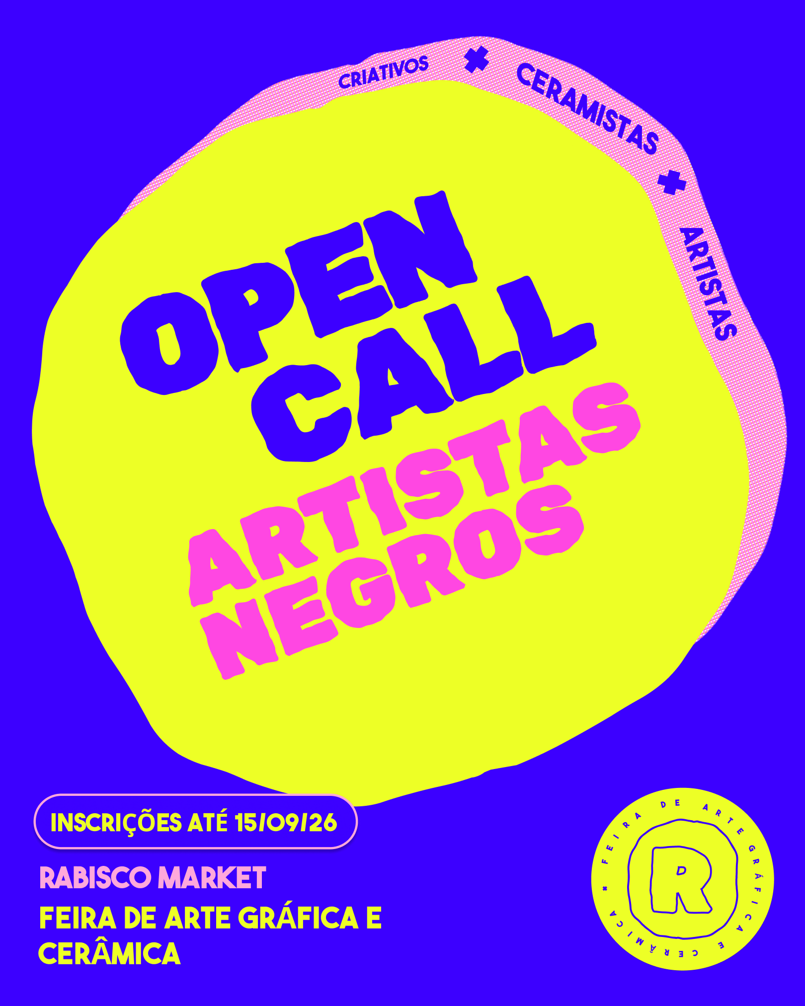
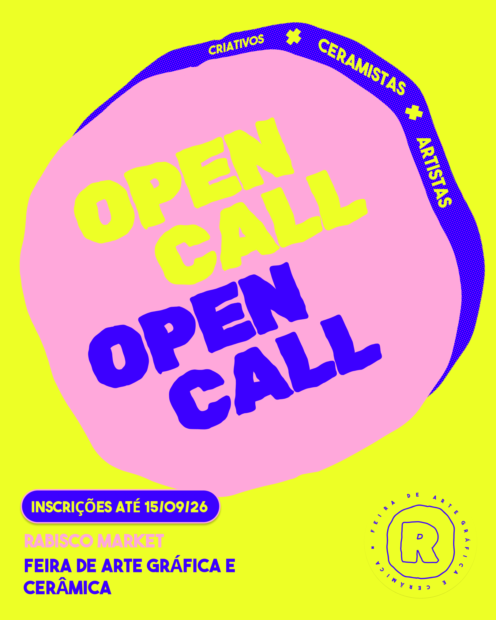
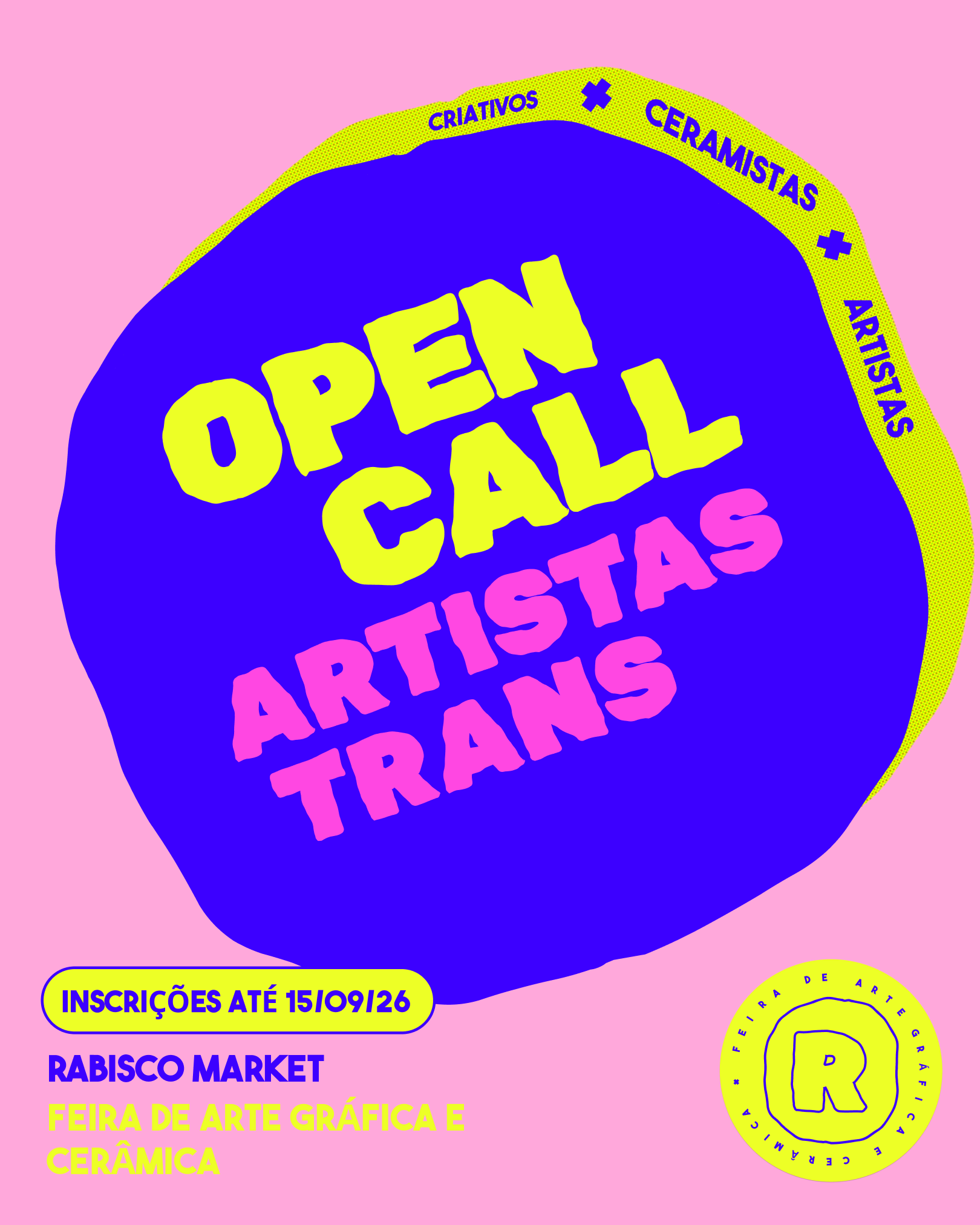
Built from the same visual toolkit, the posters use expressive typography, custom letter masks and vibrant color combinations to create eye-catching compositions that celebrate independent art and creative expression.